IELTS対策コラム

7. Mixed Charts(複合グラフ)   模範解答と解説 


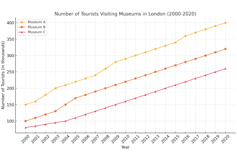
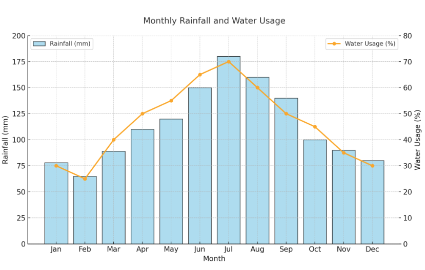
The mixed charts illustrate the monthly rainfall (in millimeters) and water usage (in percentages) in a certain region over the course of a year. The data highlights the relationship between rainfall patterns and water consumption.

Rainfall shows a clear seasonal variation, peaking in July at 180 mm and reaching its lowest level in February at 65 mm. The trend indicates higher precipitation during the summer months, with consistent levels above 150 mm from June to August. In contrast, rainfall remains below 100 mm during the winter and early spring months.

Water usage mirrors the rainfall pattern, with the highest consumption observed in July at 70%. This is likely due to increased agricultural activity, irrigation demands, and recreational water usage during the rainy season. Conversely, water usage is lowest in February at 25%, coinciding with the driest month.

The relationship between rainfall and water usage suggests that precipitation significantly influences water demand. During periods of high rainfall, water is more readily available for both agricultural and domestic use. In drier months, lower usage may reflect either conservation efforts or reduced water supply.

In conclusion, the charts emphasize the importance of managing water resources effectively to balance supply and demand, particularly in regions with pronounced seasonal rainfall fluctuations. 

(206 Words)


こちらは、月ごとの降水量と水使用率を比較した複合グラフです。

  • 棒グラフ(青色): 月ごとの降水量 (mm) を示しています。夏の月に降水量が増加している傾向が見られます。
  • 折れ線グラフ(オレンジ色): 水使用率 (%) を示しています。降水量が多い月ほど水使用率が減少しているようです。

このグラフは、降水量と水使用率の間に相関がある可能性を視覚的に捉えるのに役立ちます。


6. Map(地図)   模範解答と解説 

The maps compare the layout of a city center in 1990 and 2020, highlighting significant changes over the 30-year period. The transformations indicate urban modernization and a shift toward commercial and recreational development.

In 1990, the city center featured a large park in the northwest, a residential area in the northeast, an industrial zone in the south, and a market in the southeast. The park and residential area occupied significant portions of the city center, providing green space and housing. The industrial zone was the largest area, reflecting the city’s reliance on manufacturing at the time.

By 2020, notable changes had occurred. The industrial zone was significantly reduced in size, replaced partially by a shopping mall in the southeast. This reflects a shift from manufacturing toward retail and service-oriented industries. The park and residential area remained unchanged, indicating the city’s commitment to preserving green spaces and housing for residents.

The addition of the shopping mall suggests a focus on economic growth and urban convenience, catering to increased consumer demand. Meanwhile, the downsizing of the industrial zone aligns with global trends of deindustrialization and the rise of technology-driven economies.

Overall, the changes demonstrate a balanced approach to urban development, emphasizing modernization while maintaining essential residential and recreational spaces.    (208 Words)


こちらはある都市の1990年と2020年のレイアウトの変化を示した地図です。

  • 1990年の地図:

    • 公園(緑色)、住宅地(青色)、工業地帯(灰色)、市場(黄色)が配置されています。
  • 2020年の地図:

    • 公園と住宅地は維持されていますが、工業地帯が縮小され、ショッピングモール(オレンジ色)が追加されています。

このように、都市の構造が時代とともにどのように変化したかを視覚的に示しています。

5. Process Diagram(工程図)  模範解答と解説 

The diagram illustrates the process of generating electricity using solar panels. This system transforms sunlight into usable energy through a series of steps, demonstrating the efficiency and sustainability of solar power.

First, solar panels installed on rooftops or open spaces absorb sunlight. These panels contain photovoltaic cells that convert sunlight into direct current (DC) electricity. Next, the DC electricity flows into an inverter, where it is transformed into alternating current (AC) electricity. This conversion is essential, as most household and industrial appliances run on AC electricity.

Once converted, the AC electricity is distributed through an electrical panel, supplying power to various applications such as lighting, heating, and electronic devices. If excess electricity is produced, it can either be stored in batteries for future use or fed back into the main power grid, benefiting other users.

This process highlights the simplicity and reliability of solar energy systems. By utilizing sunlight, an abundant and renewable resource, this method offers a sustainable alternative to fossil fuels. Additionally, the ability to store surplus energy ensures continuous power supply even during cloudy periods or at night.

In conclusion, solar power is an eco-friendly and efficient solution to meet energy demands while reducing greenhouse gas emissions, contributing to a cleaner and greener future.   (207 Words)


こちらは太陽光パネルを利用した発電プロセスを示す工程図です。各ステップが以下の順で進行します:

  1. Solar Panels が太陽光を吸収します。
  2. Inverter が直流電流 (DC) を交流電流 (AC) に変換します。
  3. Electrical Panel が電力を各場所に分配します。
  4. 電力が消費されたり、蓄電されたりします。

矢印は工程間の流れを示しています

4. Table(表) 模範解答と解説 

The table compares literacy rates across six countries—USA, Canada, Germany, Japan, India, and Brazil—in 2010. The literacy rate is expressed as a percentage, reflecting the proportion of people who can read and write.

Overall, the developed nations (USA, Canada, Germany, and Japan) demonstrated near-universal literacy, with rates ranging from 98% to 99%. Germany, Japan, and the USA recorded the highest literacy rate at 99%, while Canada followed closely at 98%. In contrast, the developing nations, Brazil and India, showed significantly lower literacy rates, with Brazil at 93% and India at 74%.

This stark difference highlights the gap in educational access and quality between developed and developing countries. In developed nations, government investments, widespread access to education, and advanced infrastructure contribute to higher literacy. Meanwhile, India’s comparatively low rate reflects challenges such as poverty, lack of educational facilities, and gender disparities in schooling, particularly in rural areas.

In conclusion, the data underscores the importance of prioritizing educational development in less-developed nations to bridge the global literacy gap.    (166 Words)


こちらは、6か国(アメリカ、カナダ、ドイツ、日本、インド、ブラジル)の2020年時点での識字率を示した表です。データを見やすくまとめており、国ごとの識字率の違いが一目でわかります。

3. Pie Chart(円グラフ) 模範解答と解説 


The pie chart depicts the distribution of energy consumption across five sectors in 2020: residential, industrial, commercial, transportation, and agriculture.

The residential sector accounted for the largest share of energy consumption at 40%, followed by the industrial sector with 25%. The commercial sector used 15%, while the transportation and agriculture sectors each consumed 10%.

The dominance of residential energy use can be attributed to heating, cooling, and household appliances, which are staples of modern living. Industrial energy consumption is significant due to the high energy demands of manufacturing and production processes. The commercial sector’s energy use reflects the needs of businesses and offices. The smaller shares for transportation and agriculture indicate less overall reliance on energy in these sectors compared to others.

This data underscores the importance of improving energy efficiency in residential and industrial sectors, as they collectively consume the majority of available energy resources.  (150 Words)


こちらは2020年におけるエネルギー消費の分野別割合を示した円グラフです。住宅部門が最も大きな割合を占めており、次いで産業部門が続いています。他の分野の割合は比較的小さいことがわかります。

2. Bar Chart(棒グラフ) 模範解答と解説 

The bar chart illustrates the percentage of people in different age groups who attended live music concerts in 2021.

The highest attendance was recorded among the 20-29 age group at 80%, followed closely by the 10-19 group at 70%. However, the attendance rates declined steadily with age, with the 30-39 group at 60%, the 40-49 group at 50%, and the 50-59 group at 40%. The lowest attendance was observed among individuals aged 60 and above, at only 30%.

This data indicates that younger people are significantly more likely to attend live music events than older age groups. The steep decline between the 20-29 and 30-39 age groups suggests that life circumstances, such as career or family responsibilities, may influence entertainment preferences. Similarly, the lower attendance among those over 50 may reflect generational differences in musical tastes or accessibility issues. The data emphasizes the importance of targeting younger demographics for live music promotions.  (152 Words)


こちらは2021年における各年齢層のライブ音楽コンサートの参加率を示した棒グラフです。10代から20代の参加率が高く、年齢が上がるにつれて参加率が低下していることがわかります。


1. Line Graph(折れ線グラフ) 模範解答と解説 

The line graph illustrates the number of tourists visiting three different museums in London—Museum A, Museum B, and Museum C—from 2000 to 2020.

Overall, all three museums experienced an upward trend in visitor numbers over the 20-year period, although the rates of growth varied. Museum A consistently attracted the highest number of visitors, starting at 150,000 in 2000 and steadily rising to 400,000 in 2020. In comparison, Museum B saw a similar upward trajectory, growing from 100,000 to 320,000 over the same period. Museum C began with the lowest visitor numbers at 80,000 but also witnessed significant growth, ending at 260,000 in 2020.

Notably, the gap between Museum A and the others remained substantial throughout the period, although it narrowed slightly after 2010 as Museum B’s growth accelerated. Museum C exhibited slower growth in the early years but experienced a more pronounced increase in visitor numbers from 2010 onwards. This data highlights a growing interest in cultural tourism in London. (161 Words)


こちらは2000年から2020年までのロンドンにある3つの博物館(Museum A、Museum B、Museum C)の観光客数の推移を示す折れ線グラフです。それぞれの博物館の観光客数の変化を比較することができます。

IELTS ライティング アカデミック「Task 1」の問題形式(7種類)

IELTS Writing Academic Task 1の問題形式は、主に視覚情報(グラフや図表など)の概要を説明し、重要な傾向や比較を記述することを求められます。以下に主要な問題形式、簡単な解説、サンプル問題を示します。


1. Line Graph(折れ線グラフ)


解説
時系列データが示され、時間の経過に伴う変化や傾向を説明します。増加・減少・ピークなどを明確にすることがポイントです。

サンプル問題
The graph below shows the number of tourists visiting three different museums in London from 2000 to 2020. Summarise the information by selecting and reporting the main features, and make comparisons where relevant.


模範解答と解説


2. Bar Chart(棒グラフ)


解説
異なるカテゴリー間の比較を示します。それぞれの棒の高さが、値の大きさや割合を表します。

サンプル問題
The chart below shows the percentage of people in different age groups who attended live music concerts in 2021. Summarise the information by selecting and reporting the main features, and make comparisons where relevant.


模範解答と解説


3. Pie Chart(円グラフ)


解説
全体に対する割合を示します。各セクションの割合や全体の分布を説明することが求められます。

サンプル問題
The pie charts below show the proportion of energy consumption by different sectors in 2000 and 2020. Summarise the information by selecting and reporting the main features, and make comparisons where relevant.


模範解答と解説


4. Table(表)


解説
データが表形式で示されます。複数のデータセットを比較し、特徴的な数値や傾向を記述します。

サンプル問題
The table below shows the literacy rates in six different countries in 2010. Summarise the information by selecting and reporting the main features, and make comparisons where relevant.


模範解答と解説


5. Process Diagram(工程図)


解説
何かが作られる過程や、物事がどのように機能するかを説明します。プロセスの順序を明確に述べることが重要です。

サンプル問題
The diagram below shows the process of producing electricity from solar panels. Summarise the information by selecting and reporting the main features, and make comparisons where relevant.


模範解答と解説


6. Map(地図)


解説
特定の地域の変化や違いを比較します。過去と現在、あるいは計画された変更について説明します。

サンプル問題
The maps below show the layout of a city center in 1990 and 2020. Summarise the information by selecting and reporting the main features, and make comparisons where relevant.


模範解答と解説


7. Mixed Charts(複合グラフ)


解説
複数の形式(例: 棒グラフと円グラフ)が組み合わさった問題です。異なるデータセットを関連付けて記述することが必要です。

サンプル問題
The charts below show the average monthly rainfall and the percentage of water usage by sector in a certain country. Summarise the information by selecting and reporting the main features, and make comparisons where relevant.


模範解答と解説


提案ポイント

  • 概要(Overview): 問題の全体的な傾向や重要なポイントを簡潔に述べる。
  • 比較(Comparison): 必要に応じて異なるデータの比較を行う。
  • 数値やデータの言及: 特に注目すべき数値を具体的に示す。

どの形式でも、150ワード以上でまとまりのある回答を作成することが重要です。

IELTSライティング「プロンプトの論理的な分析と柔軟な思考」-具体例


IELTSライティングで上級者が守るべきルール

プロンプトの論理的な分析と柔軟な思考


IELTSライティングでは、出題されるプロンプト(問題文)を正確に理解し、論理的に分析した上で、柔軟に意見やアイデアを展開するスキルが求められます。以下に具体例を挙げて説明します。


1. プロンプトの論理的な分析

プロンプトの内容をしっかりと読み取り、求められていることを明確に理解することが重要です。特にキーワードや問いのタイプ(意見論述型、議論型、解決策提案型など)に注目します。

● 具体例

※ プロンプト:
Some people believe that governments should spend money on public transportation instead of building new roads. To what extent do you agree or disagree?

※ キーワードを分析:

governments: 政府が主体。
spend money on public transportation: 公共交通機関への投資。
building new roads: 新しい道路の建設との対比。

※ 問いのタイプ:

「どの程度同意するか」を問う意見論述型。

分析結果:

公共交通機関の利点、道路建設の利点を比較し、自分の立場を論じる必要がある。


2. 柔軟な思考

論理的に分析した後、幅広い視点でアイデアを展開します。一面的な意見ではなく、賛成と反対の両方を考慮する柔軟性がポイントです。

● 具体例

※ 賛成の視点:

公共交通機関の改善により、都市部の交通渋滞が緩和される。
環境負荷の軽減(例:バスや電車の利用増加によるCO2削減)。

※ 反対の視点:

新しい道路が必要な地域では、経済発展や物流の改善に貢献する。
公共交通機関がすべての地域にとって有効とは限らない。

※ 柔軟な結論:

「公共交通機関の改善は環境に有益だが、地域によっては道路建設も同様に重要であるため、両者にバランス良く投資することが望ましい。」


3. 実践のコツ

問いを再構成する: 自分の言葉で問いを言い換え、主張がずれないようにする。

例:「Should governments prioritize public transportation?」
アイデアの優先順位をつける: 最も重要なポイントを先に述べる。
例を交える: 実際の政策や事例を挙げることで説得力を高める。


まとめ

IELTSライティングで上級者になるためには、プロンプトを論理的に分析してから、柔軟に視点を広げることが必要です。これにより、説得力がありバランスの取れたエッセイが書けるようになります。

IELTSライティング – 「文字数と時間の管理」-具体例


IELTSライティングテストでは、Task 1とTask 2の2つのセクションがあり、それぞれで適切な文字数と時間配分を守ることが重要です。上級者はこれを徹底して管理し、高得点を目指します。以下に具体例を挙げて説明します。

 文字数の管理

Task 1: 最低 150語
Task 2: 最低 250語


これらの語数に達していない場合、字数不足による減点が適用されます。一方で、必要以上に書きすぎると時間を浪費し、内容がまとまりに欠けるリスクがあります。したがって、Task 1では160~180語、Task 2では260~280語を目安にするのが理想的です。


● 具体例:

Task 1でデータ分析を求められる場合、以下のように文字数を配分します:

序論 (Overview): 30~40語

「The chart illustrates the population growth in three cities over 20 years.」


主な特徴の説明 (Main Features): 80~100語
「City A saw a significant rise from 2 million to 4 million, while City B experienced a slight decline.」


追加の分析 (Supporting Details): 40~50語
「City C maintained stability, showing only minor fluctuations.」

これで約150~180語に収まります。


 時間の管理

合計時間: 60分
Task 1: 約20分
Task 2: 約40分

Task 2の配点が高いため、優先順位をつけて時間配分する必要があります。

● 具体例:
Task 2で「教育の重要性」について論じる場合:

1. 計画 (5~7分):
論点と構成を考え、箇条書きでアイデアを整理。

2. 執筆 (30分):
各段落に必要な時間を配分(序論5分、主張・反論15分、結論10分)。

3. 見直し (3~5分):
文法ミスや誤字脱字を確認し、語数もチェック。


▮ 実践の工夫

文字数と時間を守るスキルを磨くため、練習時に以下を実践します:

タイマーを使う: 実際の試験環境を再現。
語数カウントを意識: 書いた後に数え、どのくらい書けば目標に届くか体感する。
テンプレート活用: 決まり文句や構成を覚えることで時間を節約。


▮ まとめ
上級者は、文字数を守ることで減点を防ぎ、時間を管理することで全体の質を高めます。このように具体例を用いながら練習を繰り返すことで、高得点を目指せるライティング力を養うことができます。

1 2 3 4 5 6 9